
For a long time, my mental model of forms was Django’s: a Form class on the
server, a POST endpoint, redirect on success. One form, one view, one round
trip. It was clean and it worked well.
Then I started building UIs where forms need to do more than that. Validation that fires as you type. Multiple independent forms on the same page. Forms that change shape depending on what the user selects. In Plakar, each integration has its own settings, so picking S3 gives you fields for bucket, region, and credentials, while picking SFTP gives you host, port, and username. The form doesn’t know its own shape until the user has made a selection and the field definitions have come back from the API.
None of that fits the Django model. You can handle it with raw React: useState
for each field, onChange handlers, validation logic inline. For two fields
it’s fine. For twelve fields across fifteen forms, it becomes a maintenance
problem.
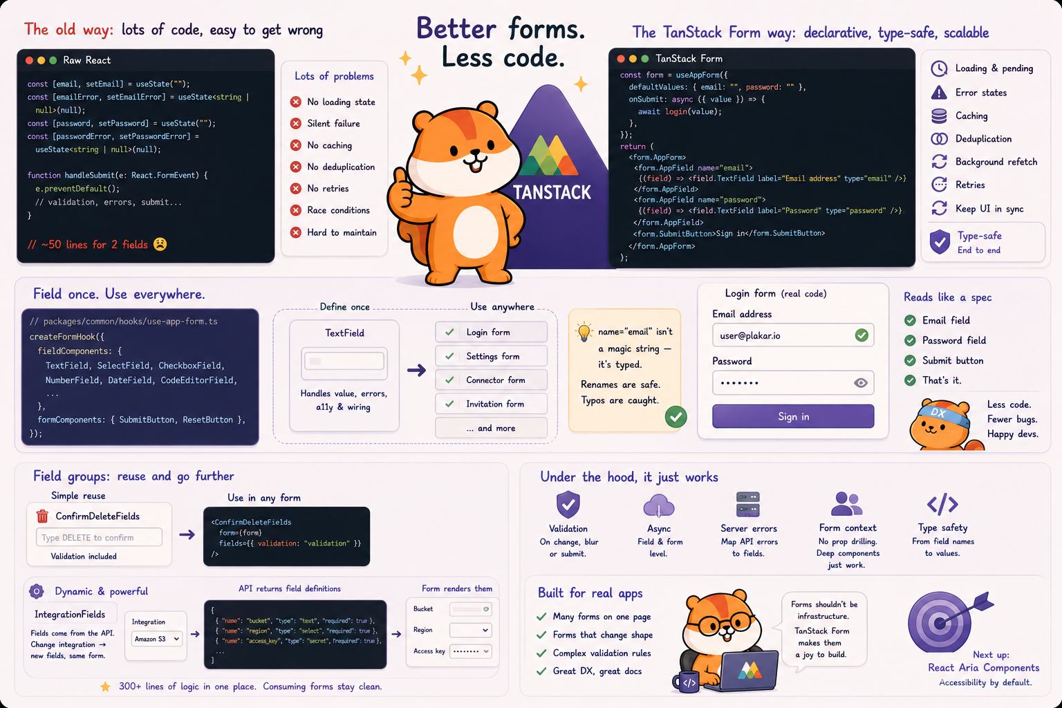
The raw approach
#Here’s a login form in raw React:
function LoginForm() {
  const [email, setEmail] = useState("");
  const [password, setPassword] = useState("");
  const [emailError, setEmailError] = useState<string | null>(null);
  const [passwordError, setPasswordError] = useState<string | null>(null);

  const handleSubmit = (e: React.FormEvent) => {
    e.preventDefault();

    let valid = true;
    if (!email) {
      setEmailError("Email is required");
      valid = false;
    }
    if (!password) {
      setPasswordError("Password is required");
      valid = false;
    }
    if (!valid) return;

    // submit...
  };

  return (
    <form onSubmit={handleSubmit} className="flex flex-col gap-4">
      <div className="flex flex-col gap-1">
        <label className="text-sm font-medium text-gray-700">Email</label>
        <input
          type="email"
          value={email}
          onChange={(e) => setEmail(e.target.value)}
          className="rounded-lg border border-gray-300 px-3 py-2 text-sm focus:border-blue-500 focus:outline-none"
        />
        {emailError && (
          <span className="text-sm text-red-600">{emailError}</span>
        )}
      </div>

      <div className="flex flex-col gap-1">
        <label className="text-sm font-medium text-gray-700">Password</label>
        <input
          type="password"
          value={password}
          onChange={(e) => setPassword(e.target.value)}
          className="rounded-lg border border-gray-300 px-3 py-2 text-sm focus:border-blue-500 focus:outline-none"
        />
        {passwordError && (
          <span className="text-sm text-red-600">{passwordError}</span>
        )}
      </div>

      <button
        type="submit"
        className="rounded-lg bg-blue-600 px-4 py-2 text-sm font-medium text-white"
      >
        Sign in
      </button>
    </form>
  );
}
About 50 lines for two fields. Add a third: copy-paste the state, the error
state, the div > label + input + error span block. Change the border radius
later and you’re touching each one individually. In a real application with
dozens of forms, that’s where bugs hide.
There has to be a better way to define a field once and use it everywhere.
The AppField pattern
#TanStack Form’s answer is to register your field components once and reuse them everywhere. Here’s the real setup from Plakar:
// packages/common/hooks/use-app-form.ts
export const { useAppForm, withFieldGroup, withForm } = createFormHook({
  fieldContext,
  formContext,
  fieldComponents: {
    AsyncSelectField,
    CheckboxField,
    CodeEditorField,
    ComboBoxField,
    DateField,
    DurationField,
    MultiSelectField,
    NumberField,
    RadioGroupField,
    SelectField,
    TagsField,
    TextAreaField,
    TextField,
    ToggleField,
    // ...
  },
  formComponents: {
    SubmitButton,
    ResetButton,
  },
});
Each field component calls useFieldContext() internally to read the current
value, handle changes, and display errors. No props passed in from the form, no
wiring at call sites — it connects itself. Defined once, and a form using it
just declares what it needs:
<form.AppField
  name="email"
  validators={{
    onChange: ({ value }) => (!value ? "Email is required" : undefined),
  }}
>
  {(field) => <field.TextField label="Email address" type="email" />}
</form.AppField>
name="email" is not a magic string. It’s typed against the form’s
defaultValues. If the field doesn’t exist, TypeScript tells you at compile
time. If you rename it, every AppField using the old name becomes a type error
immediately.
Here’s what a real form looks like. The login form from Plakman:
// apps/plakman/src/routes/login.tsx
function RouteComponent() {
  const form = useAppForm({
    defaultValues: { email: "", password: "" },
    onSubmit: async ({ value }) => {
      await mutation.mutateAsync(value);
    },
  });

  return (
    <form.AppForm>
      <FormElement handleSubmit={form.handleSubmit}>
        <form.AppField name="email">
          {(field) => <field.TextField label="Email address" type="email" />}
        </form.AppField>

        <form.AppField name="password">
          {(field) => <field.TextField label="Password" type="password" />}
        </form.AppField>

        <form.SubmitButton>Sign in</form.SubmitButton>
      </FormElement>
    </form.AppForm>
  );
}
The form body reads like a spec: email field, password field, submit button. Twenty lines, all declarative, with type-safe field names.
Field groups
#The AppField pattern solves rendering boilerplate. withFieldGroup solves a
different problem: what do you do when several forms share the same combination
of fields, or when the fields themselves are generated at runtime?
The simple case first. Every delete confirmation dialog in Plakar asks the user to type “DELETE” before proceeding. That’s a field group:
// apps/plakman/src/components/form/confirm-delete-fields.tsx
export const ConfirmDeleteFields = withFieldGroup({
  defaultValues: {
    validation: "",
  },

  render: function Render({ group }) {
    return (
      <div className="space-y-2">
        <p>
          To confirm, please type <strong>DELETE</strong> in the field below.
        </p>
        <group.AppField
          name="validation"
          validators={{
            onSubmit: ({ value }) => {
              if (value !== "DELETE") {
                return "You must enter DELETE to confirm.";
              }
            },
          }}
        >
          {(field) => (
            <field.TextField
              aria-label="Type DELETE to confirm removal"
              placeholder="DELETE"
              autoComplete="off"
            />
          )}
        </group.AppField>
      </div>
    );
  },
});
Any form that needs confirmation just includes
<ConfirmDeleteFields form={form} fields={{ validation: "validation" }} />. The
validation logic, including the “DELETE” check, lives in one place.
The more complex case is IntegrationFields. Each integration in Plakar (S3,
SFTP, local filesystem, and many others) exposes its own set of configuration
fields through the API. The field names, types, labels, required status, and
whether a field should use a secret provider are all driven by the API response.
The form doesn’t know its shape until the user selects an integration and the
field definitions come back.
IntegrationFields is a withFieldGroup that fetches the selected
integration’s configuration from the API and renders the appropriate fields
dynamically. Switching integrations re-fetches the field definitions and
re-renders the fields. Switching protocols within the same integration preserves
any values the user has already entered. Sensitive fields get routed through
secret providers instead of plain text inputs.
Without withFieldGroup, all of that logic would need to live inside every form
that includes integration selection. With it, every connector form in Plakman
just includes <IntegrationFields form={form} fields={...} type="store" /> and
moves on. Three hundred lines of field-fetching, protocol-switching, and
secret-routing logic. Consuming forms don’t know any of it.
This isn’t a tutorial
#Everything above covers the core pattern. TanStack Form does more:
- Field-level validation on change, on blur, or on submit, including async validators
- Form-level validation for rules that span multiple fields
- Server error mapping via
setErrorMapto route API errors back to specific fields withFormfor injecting a form instance into deeply nested components without prop drilling
The TanStack Form docs are thorough and worth reading. The goal here was to show why the boilerplate matters and how the AppField and field group patterns address it.
Next up: React Aria Components, the accessibility layer that sits under all the UI components in Plakar.